PROJECT OVERVIEW
Background
The Scheduler feature within the CCleaner desktop app allows customers to schedule the automatic cleaning of their PC.
This was an 8 month project spanning from Nov 21 to Aug 22.
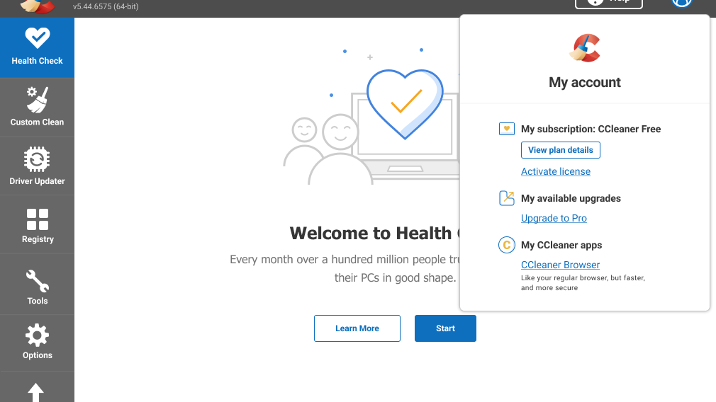
-Hidden feature: Previous user interviews revealed that customers wanted 'something to help them keep on top of their cleaning' and were genuinely surprised to find out that the feature already existed.
- Too many options: current scheduler had a vast number of choices which could be overwhelming for the customer.
Business Goals
-Increasing Sales opportunities: Improving the UX of the feature would create a valuable engagement touch point within the app which in turn will create more volume for in-app Sales messages.
Scope and Constraints
Scope changed twice during the project

Constraints related to
- Technical: limit in flexibility in software framework.
- Data: limited amount of data available; could only drill down as far as schedule frequency.
- Legacy design: existing schedule patterns that may be incompatible with the new system.
Process
1. Discovery Phase - data sources, cognitive walk through, competitive research
2. Wireframes and validation
3. Introducing Cleaning Reminders
4. Integrating both features and validation
5. Accessibility
Success Metrics
We adopted the H.E.A.R.T framework retrospectively. At the end of the project, I noticed that a lot of our success metrics were business-focussed; we didn't have anything to measure the quality of UX improvement.
I discovered the Google H.E.A.R.T framework, fell in love with it's user-centered metrics and presented this to stakeholders as a viable option to move forward with for all our projects. It was well received and I got buy-in from the team.

** Retention wasn't a focus because once a user had set a cleaning schedule there was little likelihood of them returning to the feature again.
Results
Within 2 months after release
- Engagement: 21% Increase in New installs who "Enabled a schedule" (previously at 0.14%).
- Adoption: 5.4% increase in adoption but this was mainly from Upgrades activation (previously at 0.05%) Trial flows didn't exist in the previous feature so no basis for comparison.
- Reduction in Churn: Rolling 30 day churn reduced by 2% (was previously 17.01%).
DESIGN PROCESS
Discovery Phase
I started off reaching out to the data team to gather info on how users currently engage with the existing Scheduler feature.
We could only drill down as deep as the cleaning frequency


a low proportion of new customers discovered the feature which supports the findings from user interviews where customers expressed a desire for a feature to help them schedule a clean and were surprised to find out it existed.
I then did a cognitive walk through to evaluate the learnability of the feature for new users.
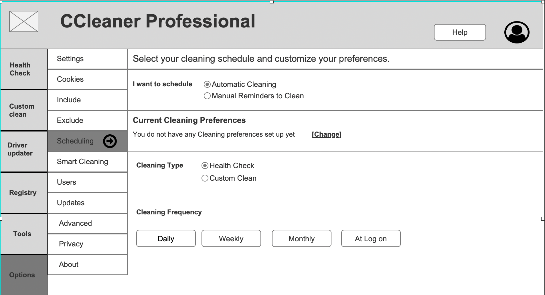
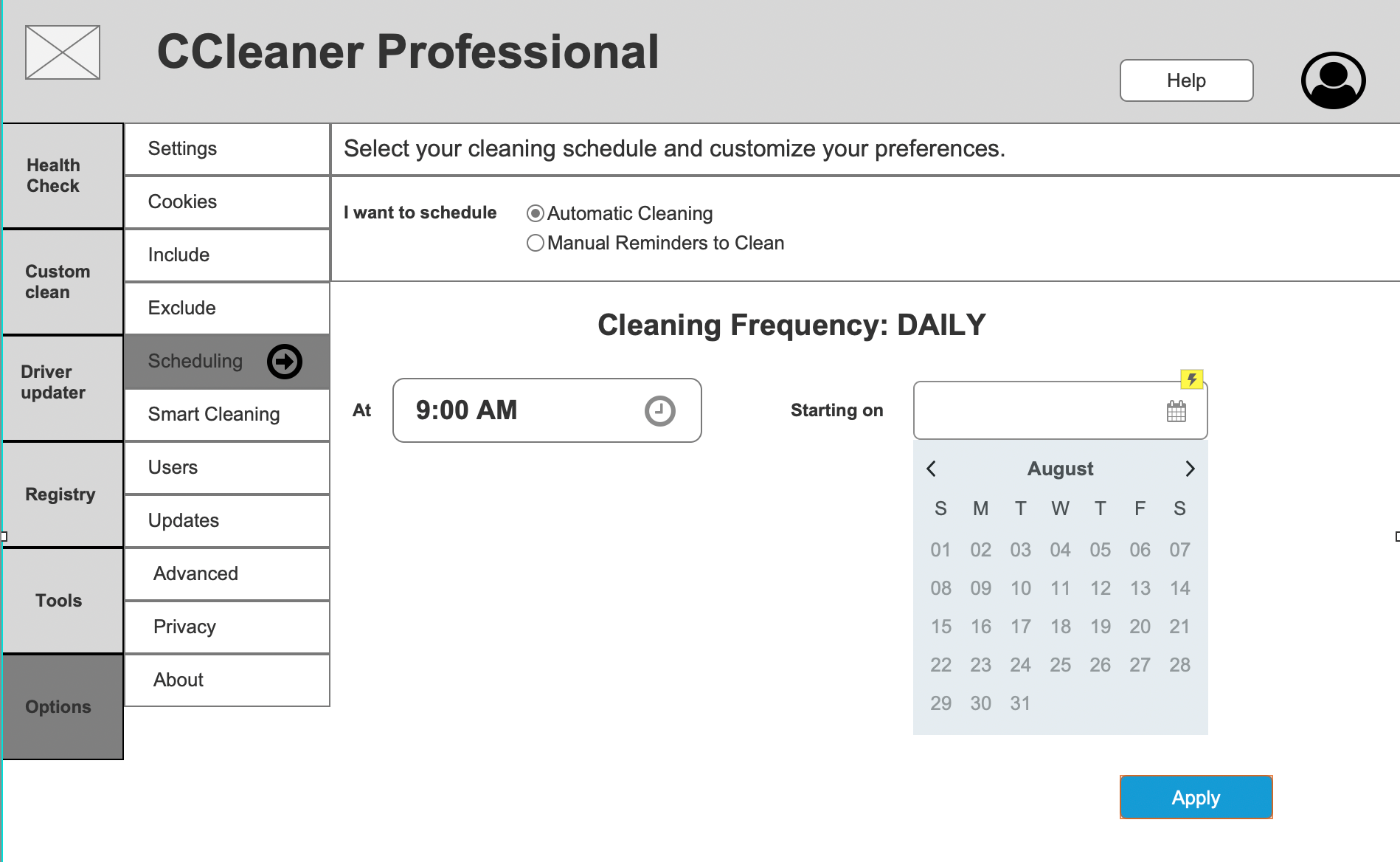
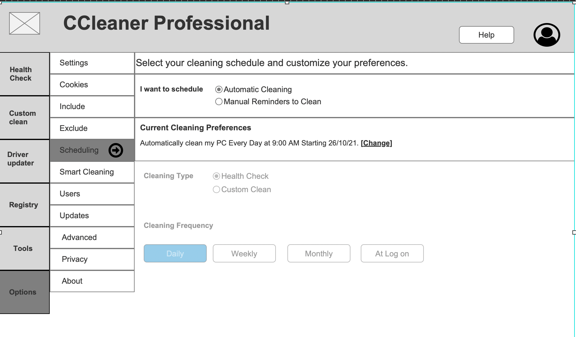
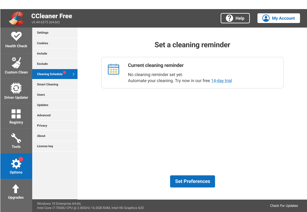
Upon landing on the Scheduler homepage, I instantly felt overwhelmed with the amount of information on there.


In addition, the whole flow of creating a schedule took place on one screen which could add to the cognitive overload.
There was also very little education for the user on the difference between setting a Health Check or a Custom Clean cleaning type.
I also did some desk research to explore how other organizations have approached the "scheduling task". Also opened this up to the team to send over apps they used personally to schedule tasks.
Wireframes & Validation
The original feature was designed in a way that the entire schedule set up flow took place on one screen. I felt that by allowing the flow to take place across a few screens, this would lighten the user's cognitive load.
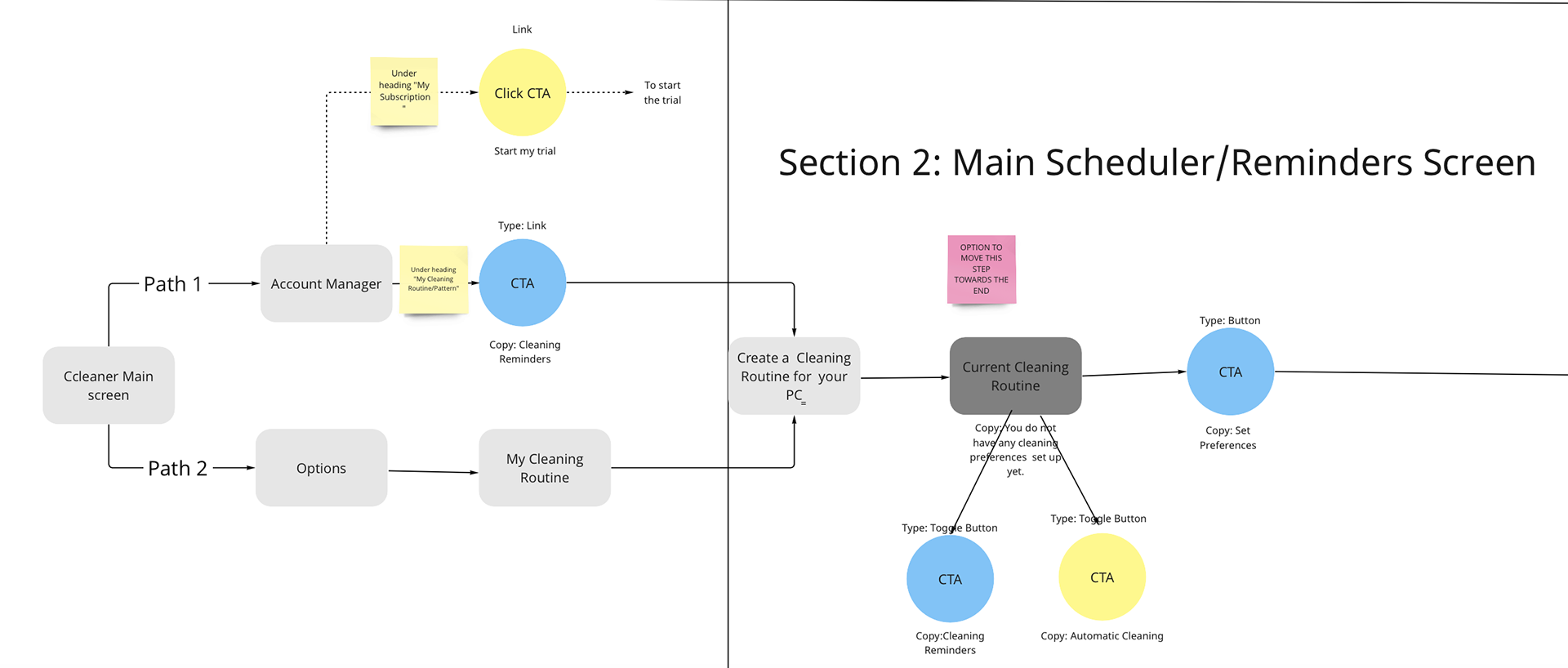
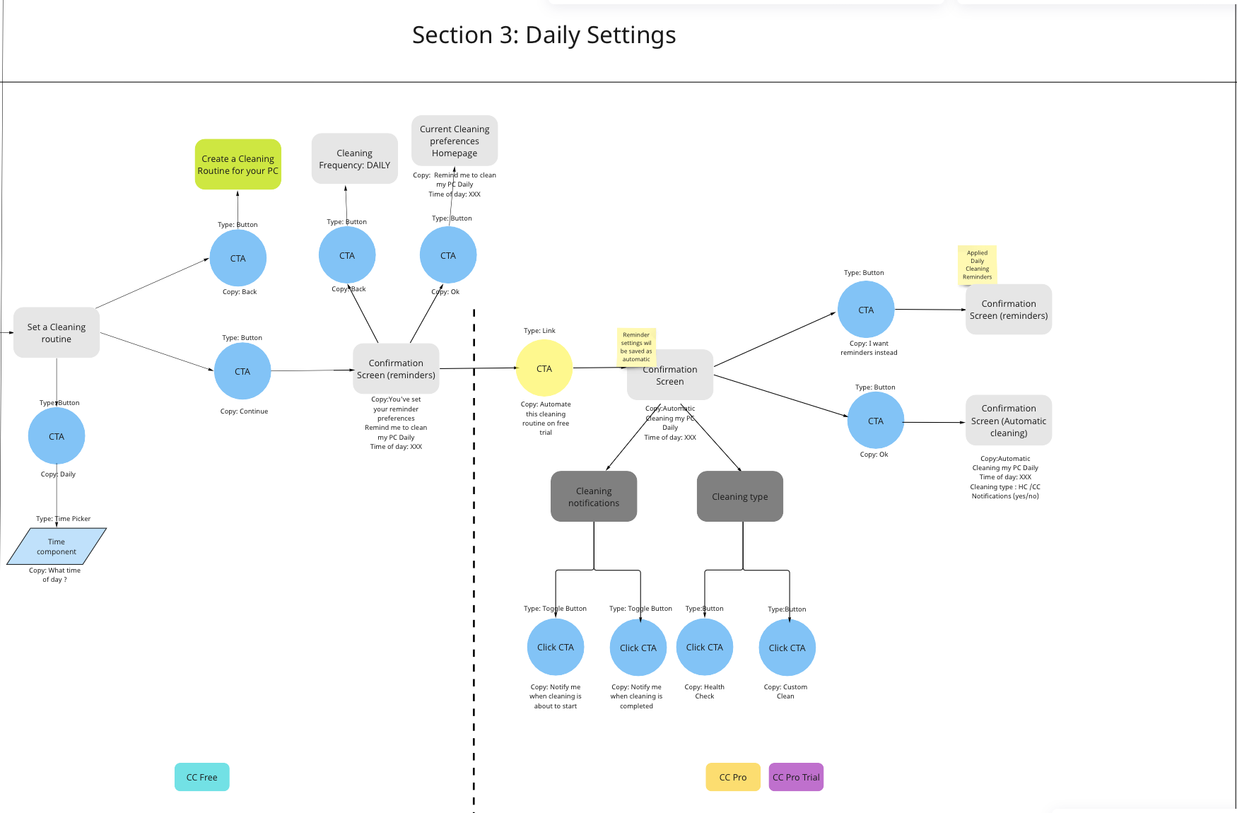
This was reflected in the user flow.
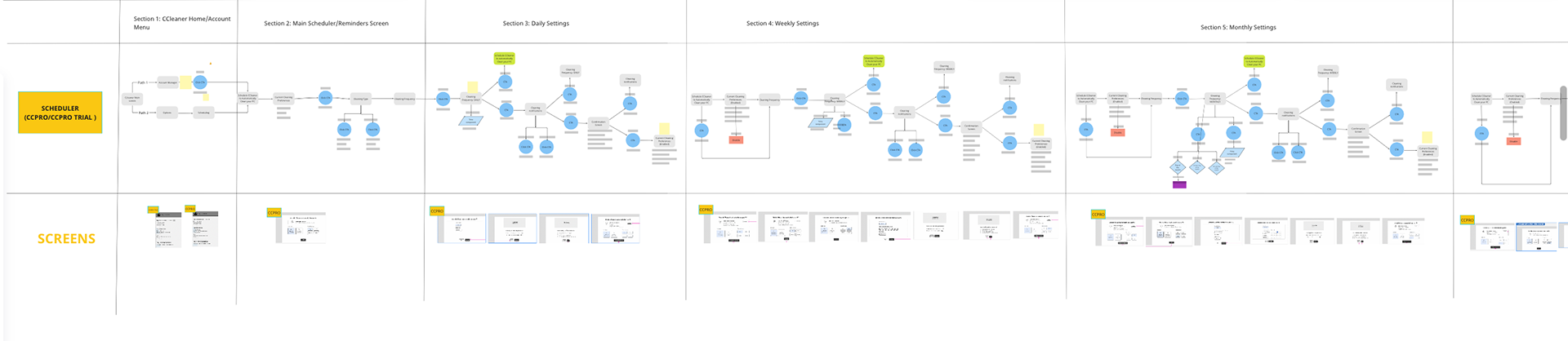
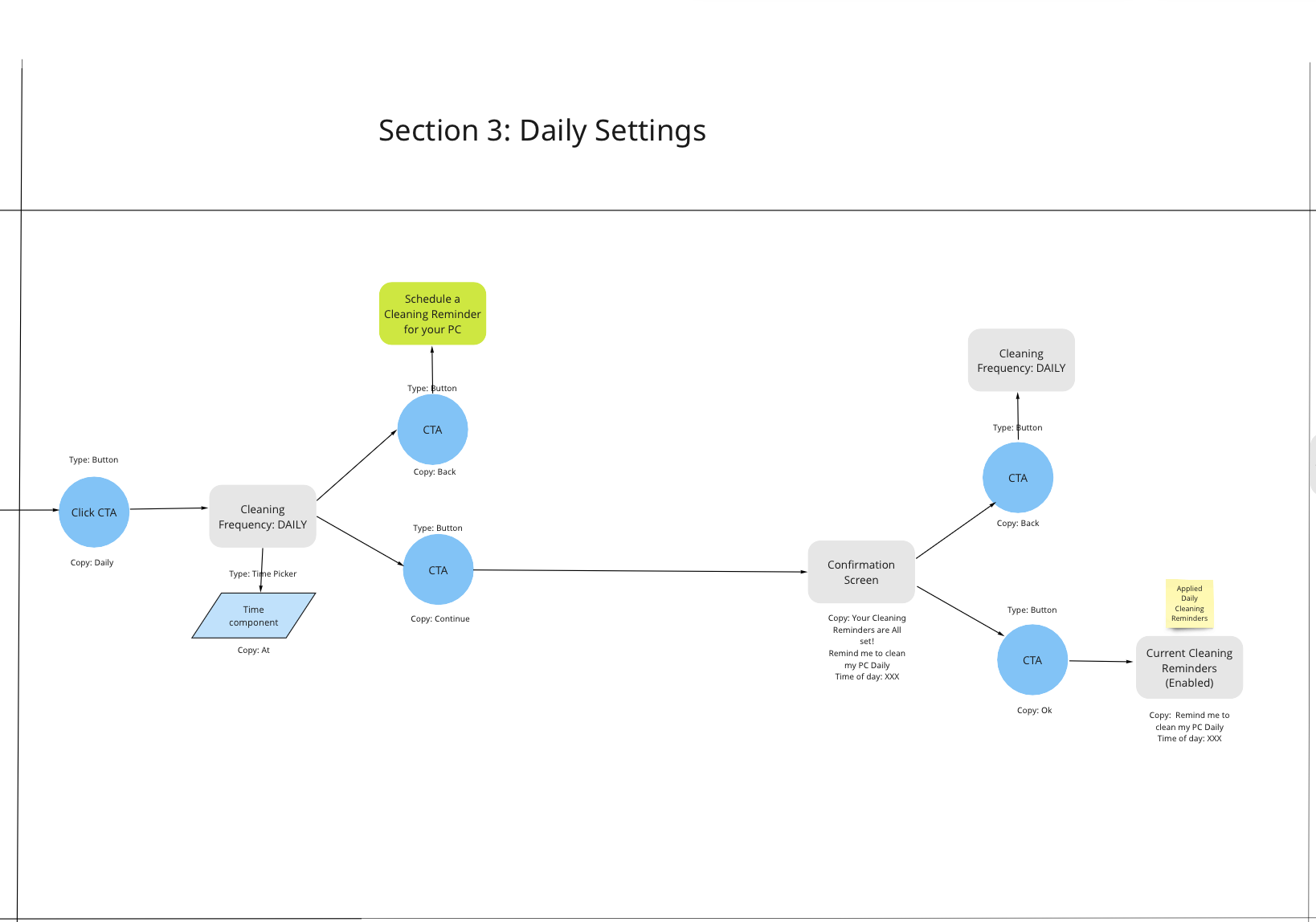
Scheduler User flow

Close up of Scheduler User flow - Main Scheduler screen and Daily settings
After aligning with stakeholders (i.e. PM, Developers and the Product Designer) on the user flow, I created the wireframes and tested the usability of the flow with Usability Hub.
Usability testing feedback
-Only 12% of participants could complete the steps needed to set up a cleaning schedule (in this case Daily)
Further work needed to simplify and clarify.
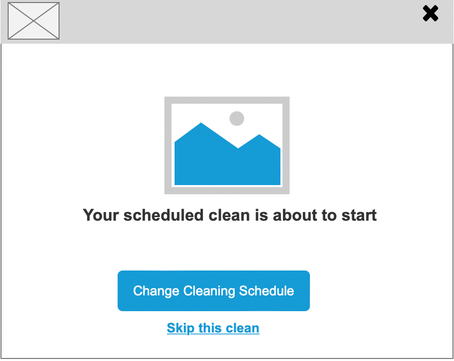
The original flow did not provide feedback to the user when the scheduled clean was taking place. I thought this was a missed opportunity to show the value added by the clean so I designed for this feedback.

1st round of testing: Feedback from Usability Hub participants

Introducing Cleaning Reminders
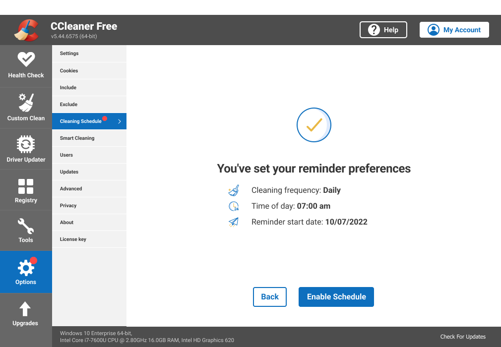
A scope change that required some updates to the user flow since Reminders would be a brand new feature being introduced for CCleaner Free users.
This scope change took place a week before the scheduled release. It took the team by surprise and for me this was a red flag that a communication disconnect existed. I suggested and facilitated an ad-hoc retrospective where we shared our thoughts on the project progress. As a team, we created a Product Spec doc to capture all the decisions made throughout the project (previously we had been using Briefs which were very high-level) and this would serve as a single source of truth for the remainder of the project.
I updated the user flow accordingly.
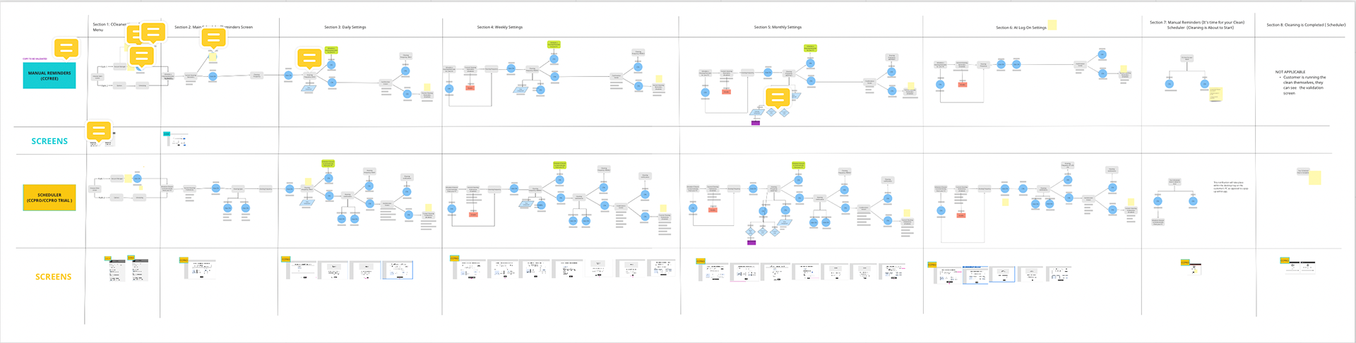
Reminders and Scheduler user flows
Close up of Reminders Daily flow
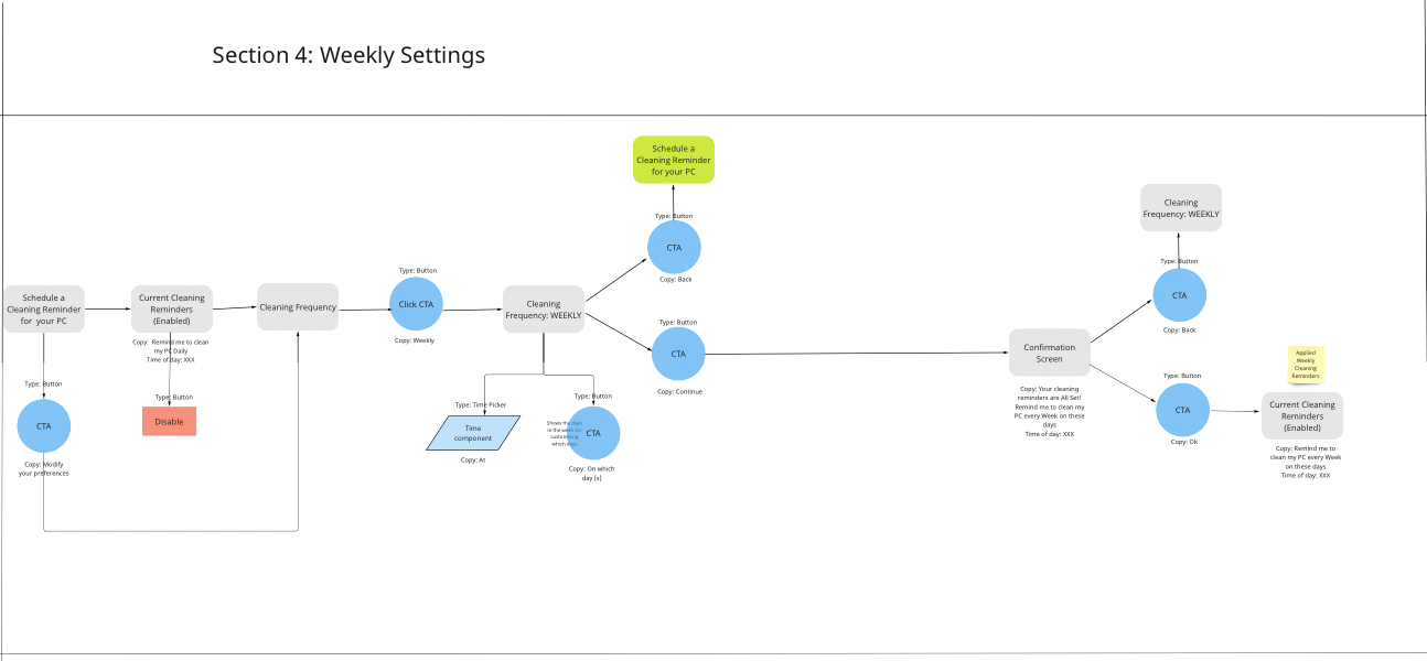
Close up of Reminders Weekly flow
There were some overlaps with the Automatic Cleaning feature so I was able to incorporate some of the usability hub feedback from Automatic Cleaning in to the Reminders design.
However, elements such as Cleaning notifications (Cleaning is about to start/has finished) and Cleaning type ( Health Check/Custom Clean) wouldn't be relevant since Reminders were about prompting the user to perform the clean themselves.
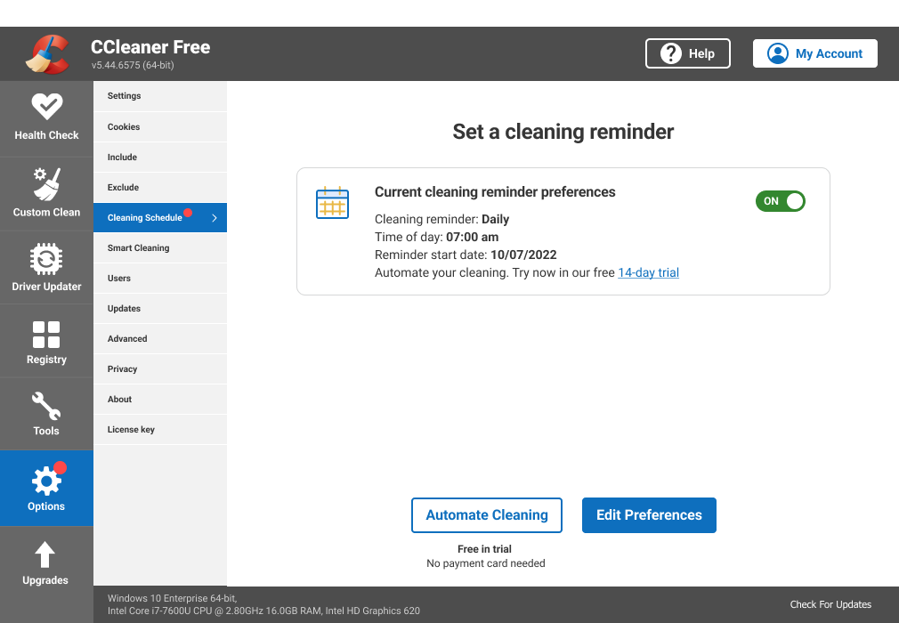
Lighten the cognitive load even further by designing the feature homepage just for 'confirming' and 'editing' cleaning preferences.

Integrating Both Features and Validation
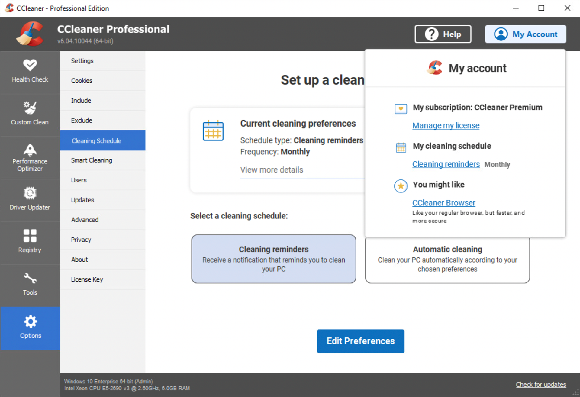
Before I could test the Reminders feature, the scope changed again to mean that each feature would no longer be exclusive to their tier.
This meant remapping the User journey to allow Free users to discover the automated feature within their version of the app and illustrate how Paying users could select either Automatic Cleaning or Cleaning Reminders for their schedule.
Both aspects of the feature would be shown on the feature homepage, however Automatic Cleaning would be accessible to CC Free users via the trial or by upgrading to CC Professional.
Short descriptions were also included to help the user understand the difference between the 2.

CC Free customer view

CC Professional Customer view
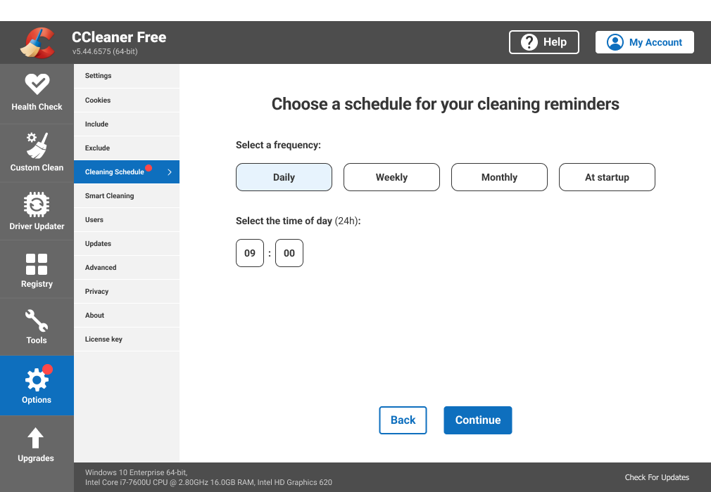
Daily Cleaning Reminders

Daily Automatic cleaning
Automatic Cleaning notifications can be switched on and off.
This was to grant the user more control over their notifications.
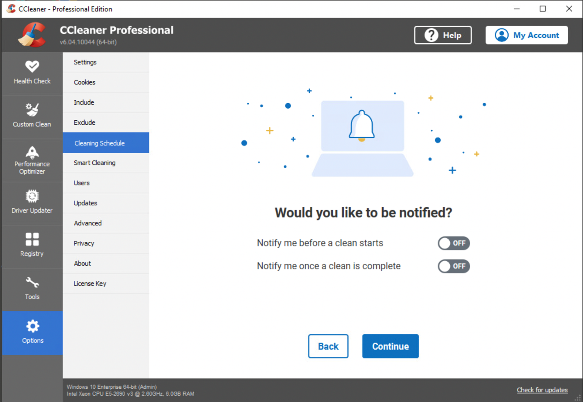
Automatic cleaning notifications
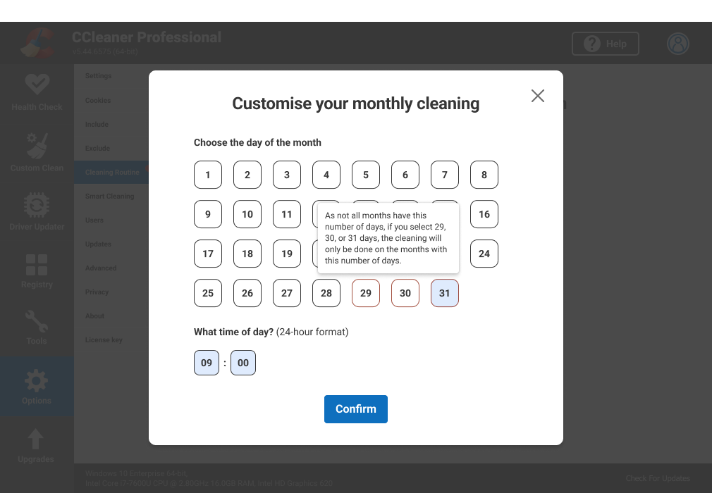
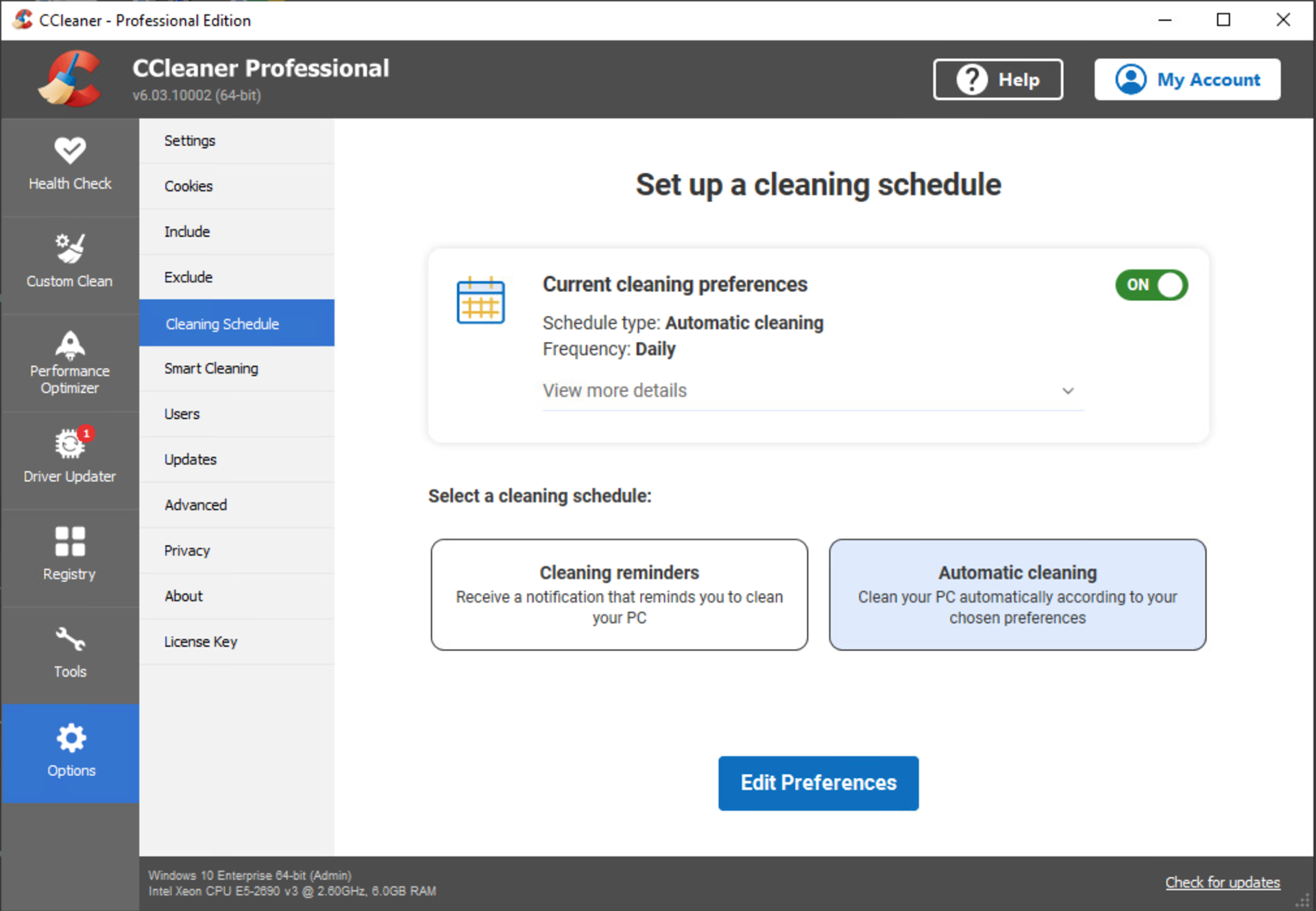
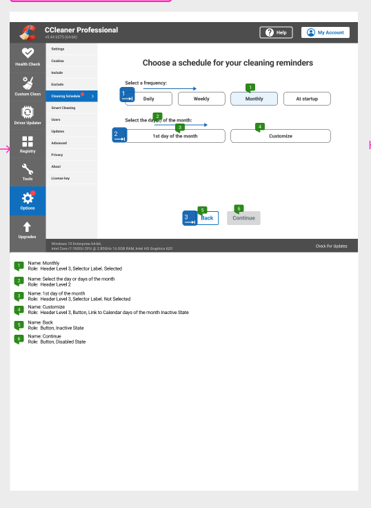
Monthly calendar days
A prompt for the user that not all months had days 29, 30 and 31
Previously, if a Monthly-on-Day 31 pattern was scheduled, the clean would only run on months with 31 days (with no feedback to the customer)
2nd round of testing: Feedback from Usability Hub participants

I included a link to the feature within the Account Manager (Project link) to make it more discoverable (Usability test participants within the Account Manager project ranked "New Features" as the 3rd most useful item they would want in the menu).
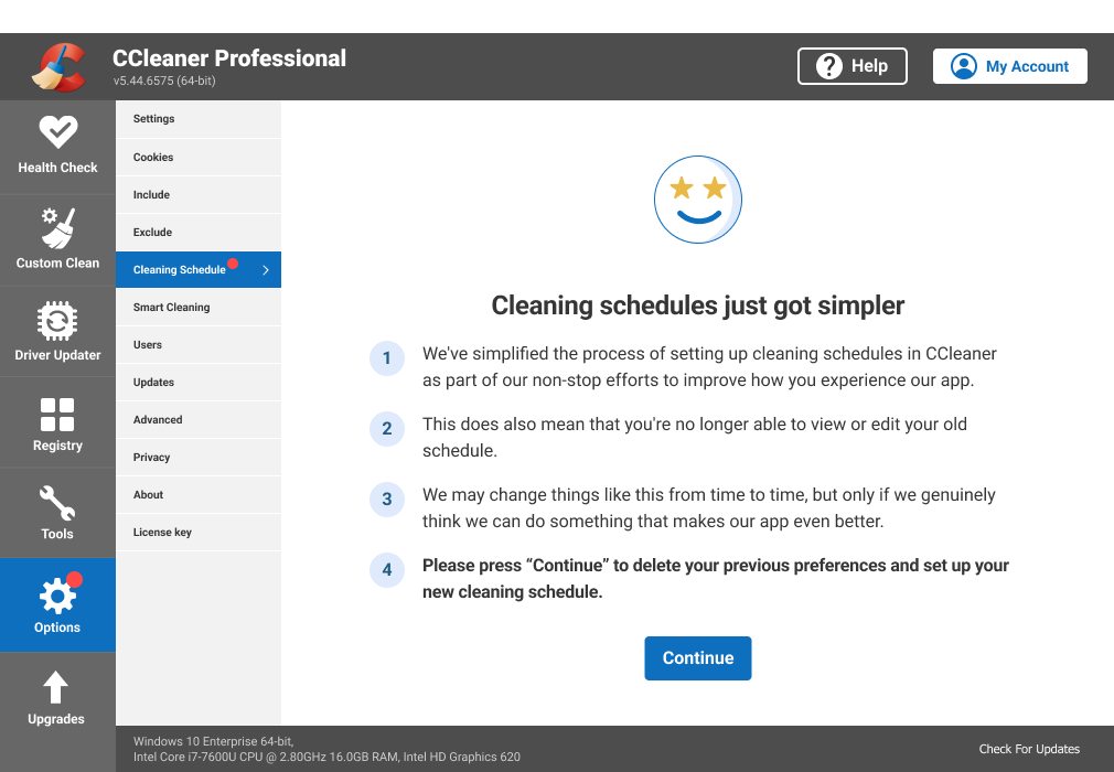
We also designed for the use case of CC Professional customers who had scheduling patterns set up from the legacy design that would no longer exist in the new design.
Accessibility
I annotated the Bluelines for the final designs so our screen reader and keyboard only users could also benefit from the feature.


REFLECTION
There were a lot of highs and lows with this project; particularly with the numerous scope changes. If I could travel back in time, I would push harder for a more holistic view of the app to be taken i.e. integrating both features as opposed to keeping them exclusive (which was not typical of other features in the app).
We also had no tangible user-centred metrics to define success. I presented the H.E.A.R.T Framework approach and successfully got buy-In from the stakeholders.
Key takeaways
Lockdown those UX metrics (EARLY): A massive learning curve for me as my previous projects had only been evaluated in terms of revenue added. User- centred metrics are also needed to evaluate the value added by a UX improvements.
Maintaining a flexible and dynamic approach: Understanding the overlaps between Automatic Cleaning and Cleaning Reminders fed into both designs and helped me move forward despite the changing scope.